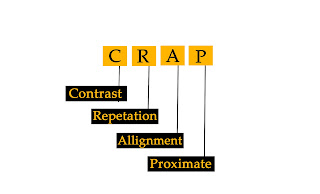
Design Is Nothing But CRAP
The principle starts with
- Balance
- Balance is an equal distribution of weight.
- In terms of graphics, this applies to visual weight.
- That is determined by its size, darkness, or lightness, and thickness of lines.
- Empty space ( white space) and filled space.
- Text and images
- Color/ no colors and different colors.
- Line of vision direction
- Orientation and location of an element.
- Color- Hue, value, saturation, temperature.
- Black often weight more than white
- Dull tones are light weight, bright tones are valuable.
- Types of Balance
- Symmetrical- evenly distributed to the left and to the right, or to top and bottom of center.
- Asymmetrical- asymmetrical balance is an arrangement of unlike objects of equal weights on each side of the page.
- Color, value, size, shape and texture cam be used as balancing elements.
- Visual Hierarchy
- Organizing information and clarifying communication
- Emphasis
- Arrangement of visual elements according to the importance.
- ABC of emphasis.
- What to emphasize what to do emphasize.
- Emphasize to all elements- visual chaos.
- Focal point
- Emphasis in isolation- isolating a shape focus attention
- By placement- position
- Through scale
- Contrast- light vs dark
- Structure- tree, nest stairs.
- Rhythm
- Strong and consistent repetition
- Pattern of element can set up a rhythm.
- Repetition and Variation.
- Proximity
- Group related items together
- Grouping related elements together into closer proximity automatically creates organization.
- Alignment
- Center, left, right
- Nothing should be placed on the page arbitrarily
- Every item should have a visual connection with something else on the page.
- Repetition
- Repeat some aspect of the design throughout the entire piece
- The repetitive element may be bold font, a thick line, a certain bullet, color design element, particular format, spatial relationship, etc.
- It can be anything that a reader will visually recognize as being "theme".
- Contrast
- Contrast is the most effective way to add visual interest to your page.
- Organization of information a reader should always be able to glance at a document and instantly understand whats going on.
- Add contrast through your typeface choices, line, thickness,colors,shapes,sizes,space.
- "If two item are not exactly the same, then make them different , really different.
- Reason
- To create an interest on the page.
- To aid in the organization of the information.
- The message should be clear and easily recognizable.
- If the page is interesting to look at, it is more likely to be read.
- White space
- White space is the art of nothing.
- White space is the absence of text and graphics.
- It breaks up the element on the page.
- It provides visual breathing room for the eye.
- 2 types of white space
- The undefined white space- which is what you get when you open a new document
- Active white space- which occurs when an object is placed in an undefined white space.


Comments
Post a Comment